Lion
Media
WEBSITE DESIGN
We live in a world that is more technologically advanced than ever, with endless sources of information at our fingertips. But so much of this information is completely unverified, and with millions of active social media users globally, the viral spread of misinformation is more rampant than ever before.
Our client, Chris McKelvy, seeks to create a platform that elevates the voices and teachings of true, credible experts through his startup, Lion Media. To achieve this, Chris envisioned a singular platform that gives users access to in-person and virtual speaking events hosted by accredited colleges and universities across the country.
“In a world of widespread misinformation, how might we create a platform to elevate experts?”

Project Scope
Our team was tasked with creating an intuitive, user-friendly desktop website for Lion Media, a platform that would give users access to speaking events by various experts in their field, hosted by accredited colleges and universities across the United States. With just a wishlist of features and a color palette preference provided by our client, our team was challenged with full development of the website from start to finish, both UX and UI design work included.
Goal
Create the Lion Media
desktop website
Role
UI/UX Designer
Sprint Lead
User Interviewer
Tools
Figma
Principle
zeroheight
Timeline
8 weeks
Surveying Our Competitors
The Lion Media concept was rather unique, so we conducted research on six various, mostly indirect competitors in the event and podcast space.
Utilizes a pop-up calendar feature, allowing users to easily add events to their calendars


Includes a banner that runs across the top of their home page, highlighting important events


The sidebar menu is a common feature amongst competitors, including Spotify

Our research revealed two main commonalities amongst our competitors:
1
Most competitors in the event, podcast and streaming space lack the ability to easily filter and customize search options.
2
These sites alternate between one of two extremes, either including far too many event details or far too few event details on the home pages.
Determining the Persona
College Student

News Junkie

Initially, our client envisioned a target audience that included both an undergraduate or graduate college student and a “news junkie”.
Early on, our team realized the importance of sticking to a singular persona, in order to better serve that demographic through our design process. We discussed this realization with our client, and it was collectively decided that the student persona was most important.
Guiding Design Principles
01
START WITH THE BASICS
Modern day undergrad and graduate students are made up largely of tech-savvy Millennials and Gen Zers who don’t require over explanation in their platforms. Only the most important basic information should be provided initially.
02
INFORMATION SCENT
People don’t like to guess. Use clear language and properly set expectations, so users aren’t unnecessarily sent down the wrong path. Layout and language should be intuitive and direct.
03
CALCULATED CUSTOMIZATION
Filters and sorting features should be specific, intuitive and allow users to more easily find events they enjoy. Customization should improve user experience, not hinder it.
Aesthetic Exploration
We created three divergent style tile options that were focused on varying explorations of the client’s color scheme and layout elements. These three concepts were tested for desirability in six rounds of user testing to help our team determine our design direction for the Lion Media website.
Clean & Straightforward
This style tile was my own straightforward take on the red, blue and purple color scheme, with a focus on highlighting speakers.
The use of colorful category tags allows users to quickly and easily discern speaking topics.

What Did Users Prefer?
What Did Users Prefer?
1.
Users appreciate when the speakers themselves are the focal point of the event and find this to be more important than even the topic of discussion.
What Did Users Prefer?
2.
Providing all basic relevant info up front is key. Users don’t want to have to click through a link or photo to find event details like location, speaker, time, etc.
What Did Users Prefer?
3.
The student demographic is drawn to a darker theme with more modern, playful layouts and icons over a stiff, corporate feel.
Wireframing Process
Below is a sampling of the wireframes I created, which were ultimately combined with features and layouts from my teammates’ wireframes. Our final layout decision was based largely upon direct feedback from our client, as we did not have time to put our three sets of wireframes through a round of user testing to gain feedback.


Calendar
High Fidelity Screen Evolution
Below is a sampling of some of the main screens our team created for the Lion Media website, from initial draft to final product. To understand and experience the full scope of our final product, please access our website prototype.
Sign Up Page
.png)
1
2
3
.png)
1
Original white background did not match the aesthetic of the dark theme and was replaced with snapshot of the Lion Media homepage when prompted to sign up
2
Made sign up the default popup, in lieu of immediately prompting users to log in, to target new website visitors
3
Added the ability to sign up via Google and Facebook to simplify the sign up process
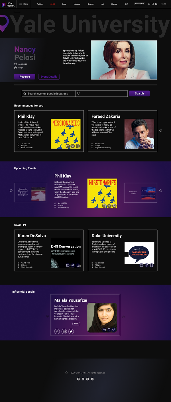
Home Page
3
2
1

1
Large location banner at top of home screen replaced with a more functional banner calendar, allowing users to track upcoming events without having to navigate to a new page
2
Changed wording on CTA from 'reserve' to register, per feedback during user testing
3
Added additional gradient color blocks to break up rows running vertically on home screen
Speaker Page
.png)
3
2
1
%20open%20updated.png)
1
Tab added to event card that gives user easy access to speaker's biography
2
Topic hashtags evolved into colored button tags for easier viewing and event date and time added to event card
3
Bottom portion of info card replaced with event recommendations for user
Future Recommendations
Upon conclusion of the Lion Media project, our design team provided the client with all final design files, as well as the following recommendations for continued development of the website, based on research and user testing:
Calendar
Create a dedicated page to host the calendar feature. As a platform that allows users to book events, Lion Media will better serve its users by providing them a full page view of their events calendar.
Settings
Consider relocating the settings feature from the left hand hamburger menu to the top right of the home page. This change should be dictated by further research and user testing.
Search Bar
Continue testing user feedback regarding the current location of the search bar. Gain feedback to determine whether users prefer the search bar to remain in its current location or to be pinned to the top of each page.